Website Front End Design: Best Practices for 2026

Website front end design has evolved from simple HTML pages into sophisticated, interactive experiences that define how users perceive and interact with digital products. The front end represents everything users see, touch, and experience when visiting a website-from the initial visual impression to the micro-interactions that guide them through conversion funnels. In 2026, successful website front end design requires balancing aesthetic appeal with technical performance, accessibility standards, and conversion-focused functionality. Understanding these elements helps businesses create digital experiences that not only attract visitors but transform them into engaged customers.
Core Principles of Modern Website Front End Design
The foundation of effective website front end design rests on several interconnected principles that work together to create cohesive user experiences. These principles guide decision-making throughout the design and development process.
Semantic Structure and Clean Code
Modern website front end design begins with semantic HTML that provides meaning and structure to content. Semantic elements like <header>, <nav>, <article>, and <section> create a logical document outline that benefits both users and search engines. This approach improves accessibility for assistive technologies while establishing clear content hierarchy.
Clean, maintainable code practices separate presentation from content through CSS and keep JavaScript focused on behavior and interactivity. When teams follow front-end design principles, they create codebases that scale efficiently and accommodate future enhancements without technical debt.
Key semantic structure benefits include:
- Improved search engine crawling and indexing
- Better screen reader navigation for users with disabilities
- Easier maintenance and collaboration among development teams
- Faster onboarding for new developers joining projects
- Enhanced performance through optimized rendering
Visual Hierarchy and Typography
Typography establishes visual rhythm and guides users through content naturally. Effective website front end design uses type scale, weight, and spacing to create clear distinctions between headings, body text, and calls-to-action.
A well-defined type system typically includes 4-6 font sizes with consistent line heights and spacing ratios. This consistency creates predictable patterns that users unconsciously recognize, reducing cognitive load and improving comprehension.
| Element Type | Font Size Range | Weight | Line Height |
|---|---|---|---|
| Hero Heading | 48-72px | Bold | 1.1 |
| Section Heading | 32-40px | Semibold | 1.2 |
| Subheading | 24-28px | Medium | 1.3 |
| Body Text | 16-18px | Regular | 1.6 |
| Small Text | 14px | Regular | 1.5 |
Color contrast ratios must meet WCAG 2.1 Level AA standards at minimum, requiring 4.5:1 for normal text and 3:1 for large text. These standards ensure readability across diverse user populations and viewing conditions.

Responsive Design and Mobile-First Approach
Website front end design in 2026 demands mobile-first thinking as the default approach. With mobile traffic representing over 60% of web usage, designing for smaller screens first ensures core functionality remains intact across all devices.
Breakpoint Strategy
Modern responsive design uses fluid grids and flexible breakpoints rather than device-specific targets. Common breakpoint ranges accommodate the spectrum of devices while maintaining design integrity.
- Mobile portrait: 320px – 480px (base styles)
- Mobile landscape: 481px – 767px (minor adjustments)
- Tablet: 768px – 1024px (layout shifts)
- Desktop: 1025px – 1440px (multi-column layouts)
- Large desktop: 1441px+ (maximal layouts)
The mobile-first approach forces designers to prioritize essential content and functionality. This constraint often leads to cleaner, more focused designs that benefit all users regardless of device. As outlined in UAE Design System guidelines, building responsive foundations early prevents costly retrofitting later.
Flexible Media and Images
Responsive images adapt to viewport dimensions and device capabilities through modern HTML attributes and CSS techniques. The srcset and sizes attributes allow browsers to select appropriate image resolutions based on screen density and layout width.
<img
  src="image-800w.jpg"
  srcset="image-400w.jpg 400w,
          image-800w.jpg 800w,
          image-1200w.jpg 1200w"
  sizes="(max-width: 768px) 100vw,
         (max-width: 1024px) 50vw,
         800px"
  alt="Descriptive text">
Container queries, now widely supported in 2026, enable components to adapt based on their parent container rather than viewport size. This advancement allows truly modular component design where elements respond to their available space independently.
Performance Optimization Techniques
Website front end design performance directly impacts user engagement, conversion rates, and search rankings. Core Web Vitals-Largest Contentful Paint (LCP), First Input Delay (FID), and Cumulative Layout Shift (CLS)-provide measurable benchmarks for user experience quality.
Asset Optimization Strategies
CSS and JavaScript management:
- Critical CSS inlined in
<head>for above-fold rendering - Deferred non-critical stylesheets using
mediaattribute manipulation - JavaScript modules loaded with
type="module"for modern browsers - Legacy fallbacks provided through
nomoduleattribute - Tree-shaking to eliminate unused code from bundles
Image and media optimization:
- WebP format with JPEG/PNG fallbacks for maximum compatibility
- Lazy loading for below-fold images using
loading="lazy" - Video content served through adaptive bitrate streaming
- Icon systems using SVG sprites or icon fonts
- Placeholder images during initial load to prevent layout shift
Modern front-end development trends emphasize build-time optimization through static site generation and edge computing, reducing server processing time and improving time-to-first-byte metrics.
Caching and Delivery Networks
Strategic caching policies leverage browser storage to minimize repeated downloads. Static assets receive long cache lifetimes with fingerprinted filenames that force cache invalidation when updated. Content delivery networks distribute assets geographically, reducing latency for international audiences.
| Resource Type | Cache Duration | Strategy |
|---|---|---|
| HTML Pages | No cache / Revalidate | Dynamic content |
| CSS/JS Bundles | 1 year | Fingerprinted filenames |
| Images/Media | 6-12 months | Version in URL |
| Web Fonts | 1 year | Preload critical fonts |
| API Responses | Varies | Based on data volatility |

Accessibility and Inclusive Design
Accessibility represents both ethical responsibility and business opportunity in website front end design. Approximately 15% of the global population experiences some form of disability, making accessible design essential for reaching full market potential.
WCAG Compliance Standards
Web Content Accessibility Guidelines (WCAG) 2.1 Level AA compliance has become the baseline standard for professional websites. These guidelines address four core principles through specific success criteria.
Perceivable content requirements:
- Text alternatives for non-text content
- Captions and transcripts for multimedia
- Content presentable in different ways without losing meaning
- Sufficient color contrast between text and backgrounds
Operable interface elements:
- All functionality available via keyboard
- Users have adequate time to read and use content
- Content doesn't cause seizures through flashing
- Multiple navigation methods provided
Understandable information:
- Text readable and understandable
- Pages appear and operate predictably
- Input assistance helps users avoid and correct mistakes
Robust compatibility:
- Content compatible with assistive technologies
- Valid HTML and ARIA markup where appropriate
- Progressive enhancement for older browsers
Following front-end best practices ensures accessibility becomes integrated into design workflows rather than retrofitted later.
Focus Management and Keyboard Navigation
Logical tab order allows keyboard users to navigate efficiently through interactive elements. Custom components must include appropriate focus indicators and ARIA attributes to communicate their purpose and state to assistive technologies.
Skip links provide shortcuts to main content areas, allowing users to bypass repetitive navigation. Focus traps in modal dialogs prevent keyboard focus from leaving the modal context until explicitly dismissed.
Interactive Elements and Micro-Interactions
Website front end design leverages micro-interactions to provide feedback, guide actions, and create delightful user experiences. These small animations and state changes make interfaces feel responsive and alive.
Animation and Transition Design
Purposeful animations serve functional roles beyond decoration. They direct attention, indicate relationships between elements, and provide continuity during state changes. Effective animations typically complete within 200-400 milliseconds-fast enough to feel snappy but slow enough to perceive.
Common animation use cases:
- Loading states: Skeleton screens and progress indicators maintain engagement during content fetch
- State changes: Button press effects and hover states confirm interactivity
- Navigation transitions: Page and component transitions provide spatial context
- Data updates: Smooth value changes in charts and counters
- Attention direction: Subtle motion draws focus to important elements
The prefers-reduced-motion media query respects user preferences for minimal animation, essential for users with vestibular disorders. Website front end design should provide static alternatives for all animated content.
Form Design and Validation
Forms represent critical conversion points where website front end design directly impacts business outcomes. Well-designed forms reduce abandonment through clear labels, helpful error messages, and logical field progression.
Real-time validation provides immediate feedback as users complete fields, catching errors before submission. Inline error messages appear adjacent to problematic fields with specific guidance for correction. Success states reinforce correct completion through subtle visual confirmation.
Professional agencies offering UI / UX Design services understand that conversion-optimized forms balance thoroughness with brevity, requesting only essential information while building trust through transparent data handling practices.
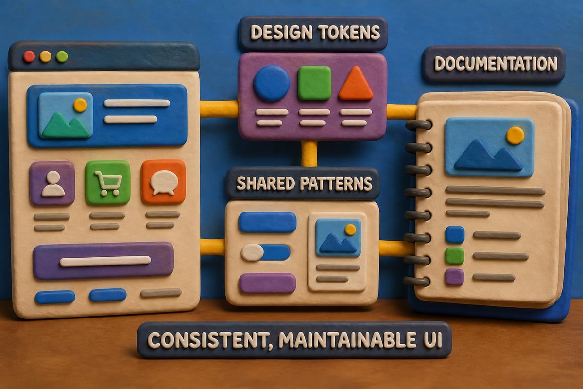
Component-Based Architecture
Modern website front end design embraces modular component systems that promote consistency and efficiency. Design systems codify reusable patterns into documented components that maintain visual and functional coherence across products.
Design Token Systems
Design tokens establish foundational values for colors, typography, spacing, and other design properties. These tokens exist as platform-agnostic data that transforms into format-specific code for web, iOS, Android, or other platforms.
Token hierarchy example:
- Brand tokens: Primary colors, brand typefaces
- Semantic tokens: Success green, error red, warning yellow
- Component tokens: Button padding, card shadows, input borders
This abstraction layer allows global design updates through token value changes that propagate throughout the system automatically. Version control for tokens enables rollback and testing of design variations.
Component Documentation
Living style guides document component usage, variants, and implementation details. These resources serve both designers and developers, ensuring consistent application across projects and team members. The documentation should be accessible through the GAP3 services portfolio, providing clear examples and code snippets.
Emerging Technologies and Trends
Website front end design continues evolving with new capabilities and paradigms. Staying current with front-end development trends helps maintain competitive advantage and deliver cutting-edge experiences.
AI-Driven Personalization
Machine learning models now enable real-time interface adaptation based on user behavior, preferences, and context. These systems adjust content ordering, feature visibility, and recommendation prominence to optimize for individual user goals.
Personalization extends beyond content to interface elements themselves. Adaptive layouts reorganize navigation structures based on individual usage patterns, surfacing frequently accessed features while deprioritizing rarely used options.
Progressive Web Applications
PWA capabilities blur boundaries between web and native applications. Service workers enable offline functionality, background sync, and push notifications while maintaining the web's discoverability and update advantages.
PWA implementation benefits:
- App-like experience with installability to home screen
- Offline content access through intelligent caching
- Fast performance through aggressive asset optimization
- Engagement through push notifications
- Reduced development cost versus separate native apps
According to research on front-end development capabilities, emerging AI tools are beginning to assist with interface generation, though human expertise remains essential for strategic design decisions.
Testing and Quality Assurance
Comprehensive testing validates that website front end design functions correctly across browsers, devices, and user scenarios. Multi-layered testing strategies catch issues before production deployment.
Cross-Browser Compatibility
Modern evergreen browsers receive automatic updates, but website front end design must still accommodate version differences and rendering engine variations. Progressive enhancement ensures core functionality works universally while advanced features enhance experiences in capable browsers.
Automated testing tools check layout consistency, JavaScript functionality, and visual regression across browser combinations. Manual testing supplements automation for nuanced interactions and subjective quality assessment.
| Testing Type | Tools/Approach | Frequency |
|---|---|---|
| Visual Regression | Percy, Chromatic | Each commit |
| Unit Testing | Jest, Vitest | Continuous |
| Integration Testing | Cypress, Playwright | Daily builds |
| Performance | Lighthouse, WebPageTest | Weekly |
| Accessibility | axe, WAVE | Each release |
User Testing and Iteration
Real user feedback reveals usability issues that technical testing misses. Moderated usability sessions observe how actual users navigate interfaces and complete tasks, identifying confusion points and workflow bottlenecks.
A/B testing validates design decisions with quantitative data. Comparing conversion rates, engagement metrics, and task completion times between variants informs evidence-based design iteration. Teams can leverage portfolio examples to understand proven patterns that drive results.
Content Strategy Integration
Website front end design succeeds when visual presentation aligns with content strategy. The interface should enhance rather than compete with content, using design elements to support messaging hierarchy and user journeys.
Readability and Scannability
Users scan rather than read web content, extracting key information through headings, bullet points, and visual emphasis. Website front end design supports this behavior through generous whitespace, clear type hierarchy, and strategic content chunking.
Optimal line length ranges from 50-75 characters for sustained reading comfort. Wider measure reduces readability while narrower measure creates choppy rhythm. Paragraph spacing and list formatting break content into digestible segments.
Content Loading Strategies
Skeleton screens provide instant feedback while actual content loads, reducing perceived wait time. These placeholder layouts match final content structure, preparing users for incoming information without jarring layout shifts.
Infinite scroll works well for social feeds and image galleries where continuous browsing is expected. Pagination suits content that users need to reference or return to, providing clear stopping points and location markers. Understanding these patterns helps businesses explore available tools for implementing effective content strategies.
Security Considerations
Website front end design intersects with security through input validation, authentication interfaces, and data handling practices. While backend systems enforce security policies, front-end implementation provides the first line of defense against common attacks.
Input Sanitization
Client-side validation prevents malformed data submission while improving user experience through immediate feedback. However, front-end validation complements rather than replaces server-side security checks, as client code can be bypassed.
Cross-site scripting (XSS) prevention requires escaping user-generated content before rendering. Modern frameworks handle this automatically, but custom implementations need explicit sanitization. Content Security Policy headers restrict script sources, mitigating XSS risk.
Authentication Patterns
Login interfaces balance security with usability through progressive disclosure and clear error handling. Password visibility toggles, strength indicators, and multi-factor authentication flows require careful website front end design to avoid user frustration while maintaining security standards.
Session management displays clear authentication status and provides accessible logout options. Auto-logout warnings give users opportunity to extend sessions before forced disconnection loses unsaved work.
Collaboration and Handoff
Effective website front end design requires seamless collaboration between designers, developers, and stakeholders. Modern workflows use shared tools and documentation to maintain alignment throughout project lifecycles.
Design-to-Development Workflow
Design tools like Figma provide developer handoff features that expose spacing, typography, and color values directly from design files. Component specifications document states, variants, and interaction patterns that developers implement.
Version control integrates design assets alongside code, creating single source of truth for project state. Design changes trigger notifications to relevant team members, maintaining awareness across disciplines.
Collaboration best practices:
- Regular design reviews with development team input
- Shared component libraries synchronized between tools
- Documentation of design decisions and rationale
- Prototypes for complex interactions before development
- Accessibility annotations on design deliverables
Following established front-end development checklists ensures nothing falls through gaps between disciplines.
Analytics and Continuous Improvement
Data-driven website front end design evolves based on user behavior insights and performance metrics. Analytics integration reveals how real users interact with interfaces, informing optimization priorities.
Behavioral Analytics
Heat maps visualize where users click, scroll, and focus attention. These patterns reveal whether design elements attract expected engagement or get ignored. Session recordings show actual user journeys, exposing friction points and confusion.
Funnel analysis identifies where users abandon conversion paths. Drop-off analysis between funnel steps highlights specific pages or interactions requiring optimization attention. Event tracking measures engagement with specific features and content types.
Performance Monitoring
Real user monitoring (RUM) captures actual performance experienced by diverse users across network conditions and devices. Synthetic monitoring provides controlled testing from multiple geographic locations. Together, these approaches paint complete performance pictures.
Core Web Vitals trends over time indicate whether optimizations improve experience or if performance degrades with feature additions. Setting performance budgets prevents bloat by establishing maximum acceptable values for page weight and load times.
Organizations seeking comprehensive digital solutions can benefit from understanding how agencies approach these challenges. Reviewing the company background and capabilities helps align website front end design projects with experienced partners.
Website front end design in 2026 demands balancing aesthetic appeal with technical performance, accessibility standards, and measurable business outcomes. Success requires understanding user needs, implementing proven patterns, and continuously iterating based on data insights. Whether building new digital experiences or optimizing existing properties, professional expertise ensures projects deliver results. GAP3 – Digital Agency & IT Solutions combines conversion-focused design with technical excellence to create websites that engage users and drive business growth. Ready to transform your digital presence? Reach out to explore how strategic website front end design can accelerate your success.
Article written using RankPill.